

My name is Anders,
I’m a UI & UX designer.
I promote and design
positive interfaces 
Like any other graphics designer, I used Photoshop as my digital playground in my early days. After studying graphics design and web development at the university I started to work professionally as a web designer and front-end developer. A hundred websites and billions of pixels later I figured out that the design part attracts me more than writing code, so I changed direction and aimed at becoming a full-stack UI designer.

I promote and design
positive interfaces 
Like any other graphics designer, I used Photoshop as my digital playground in my early days. After studying graphics design & web development at the university I started to work professionally as a web designer and front-end developer. A hundred websites and billions of pixels later I figure out that the design part attracts me more than writing code, so I change direction and aim at becoming a full-stack UI designer.
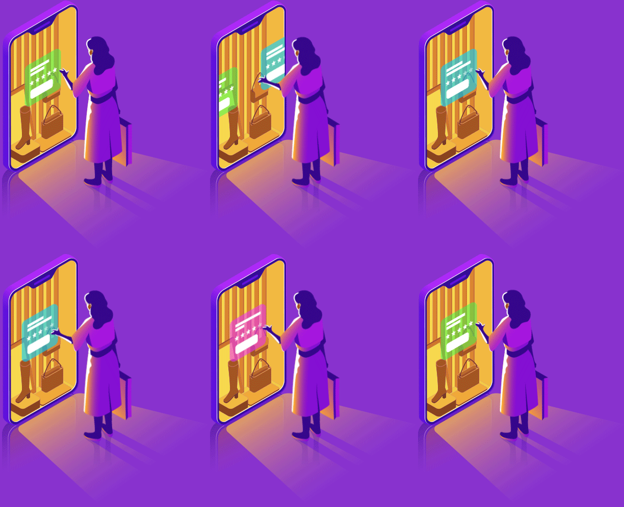
Today I’m a UX designer working at  Opera as part of the mobile team, where I’ve been since 2014. Every day I try to make positive user interfaces that are fun and easy to use. Working at Opera gives me the opportunity to design products used by hundreds of millions of users around the world in their everyday life. Whether it’s about online shopping, being up-to-date on news or sending money to your friends, I get to work with some of the best in the business to take on these challenges.
I’m all ears for new projects, even if it’s not revolutionizing the world. Let’s schedule a quick call or send me a message and we’ll see where it leads.
At the beginning of 2021, Opera launched the new innovative chat service called Hype where I was leading the design part and worked closely with developers to build a messaging client inside our browser Opera Mini. The user experience was tailored to African markets such as Nigeria, Kenya, Ghana and South Africa where we quickly gained traction. Today, we provide millions of users with a modern communication tool with custom emojis.
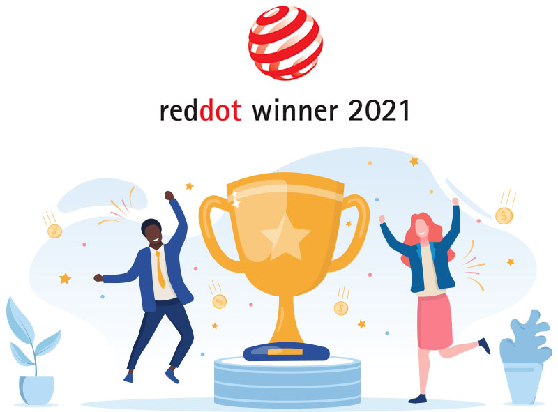
My team and I won the 2021 Red Dot Design Award in the category Social Networking App. The Red Dot Award is a global industry leader in design and user experience and is well-known in the world of UX.
A selection of my portfolio

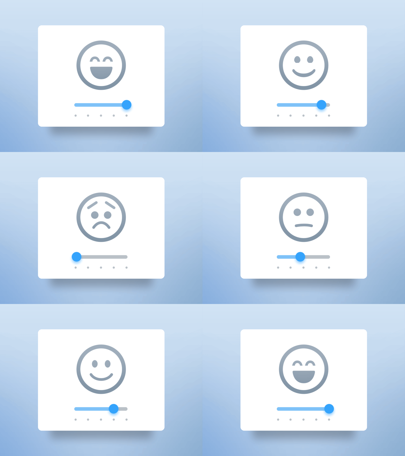
Rating slider
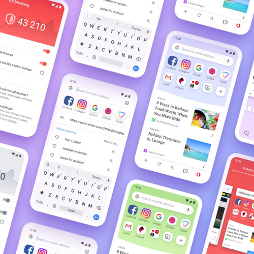
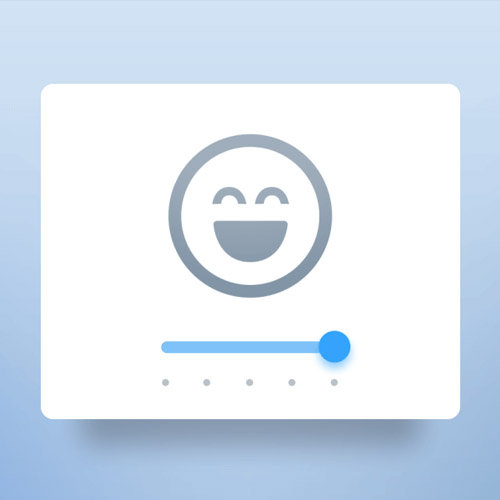
One of the suggestions of how the user could give feedback for Opera Mini for Android. One of the biggest problems of requesting feedback and rating is the lack of interest from the user's perspective. The idea here is to make the visualization appealing enough to make the user interact with it.
Get Opera: http://www.opera.com/
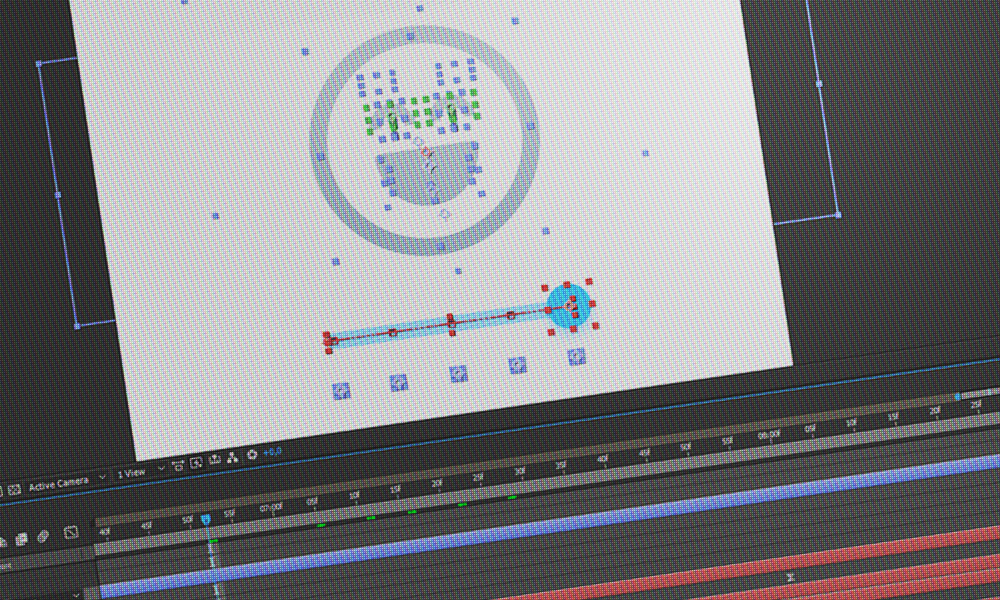
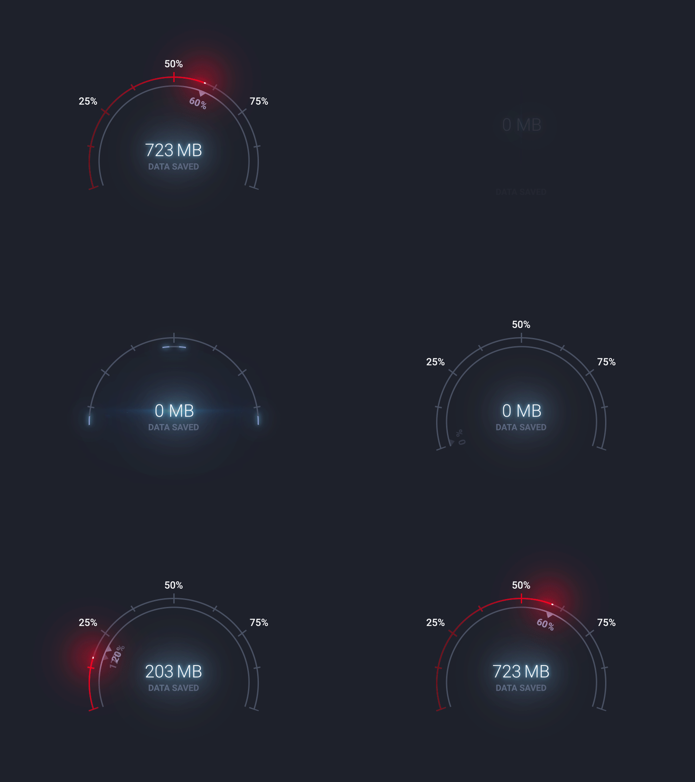
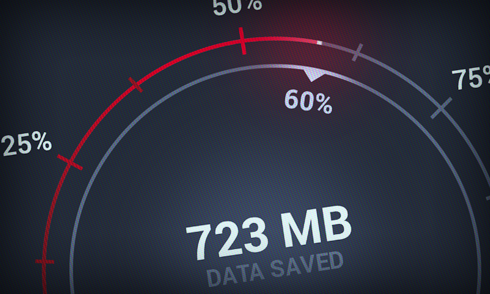
Data Savings Speedometer
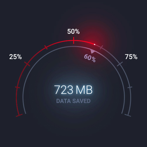
Concept for data savings visualization in Opera Mini for Android.
Get Opera: http://www.opera.com/
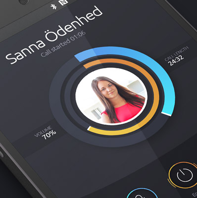
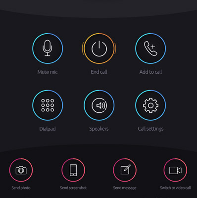
Android Call Dial
An early concept for Android focusing on improving the call dial interface. Too many relevant actions were hidden and the structure was too clumsy.
Photoshop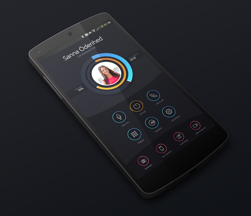
Random logotype
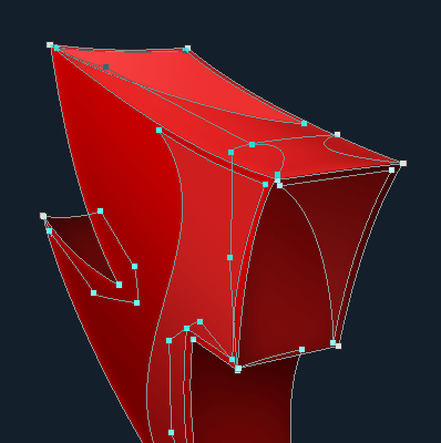
Practicing in making 3D vector objects in Photoshop.
Photoshop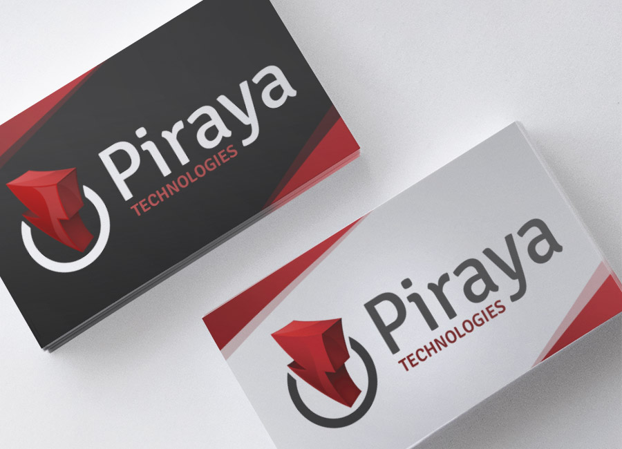
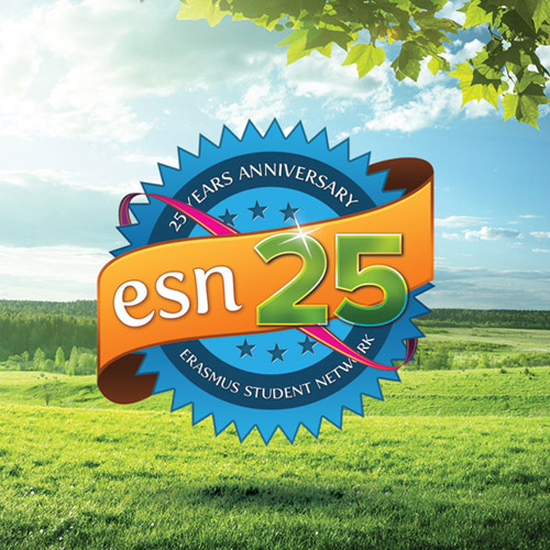
ESN Logotype Contest
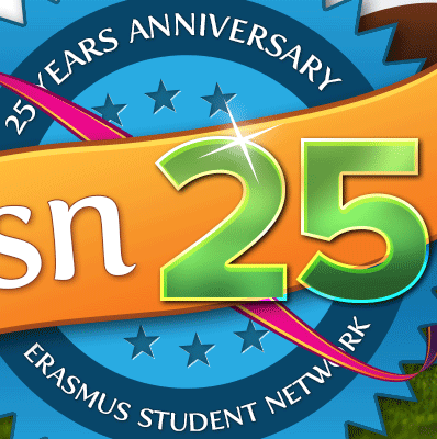
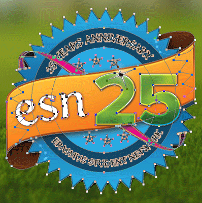
This is my entry for a design contest ESN held to celebrate their 25 years anniversary. The task was to create a new vector logotype that contains the ESN identity colors and the numbers 25.
Photoshop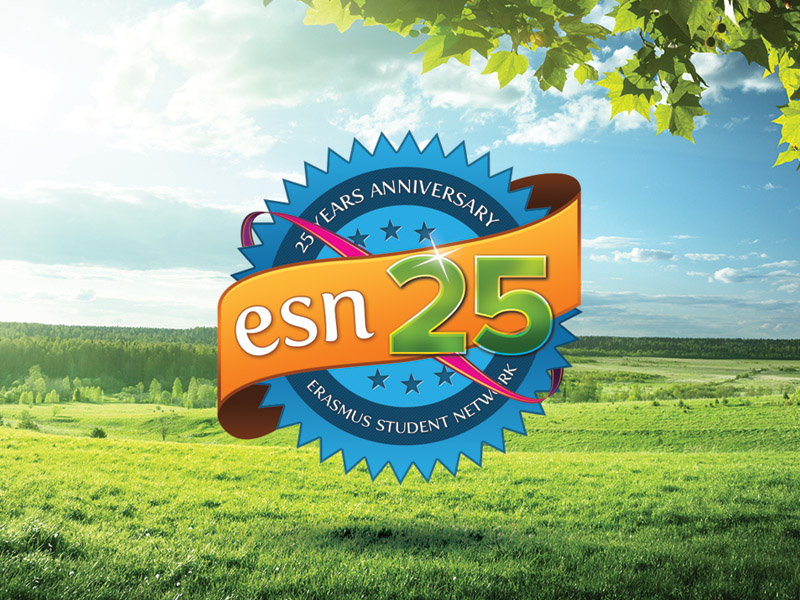
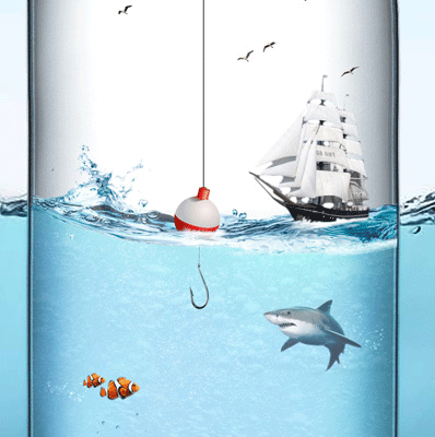
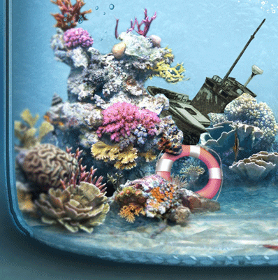
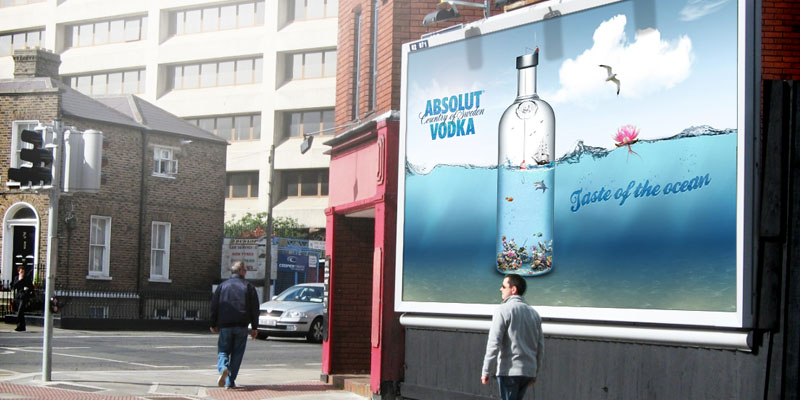
Absolut Vodka Concept
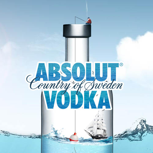
"Absolut Vodka - Taste of the ocean" is a project I worked on for fun. I wanted to practise photo manipulation in a more serious way. I don't think this would be a hit though as I'm not a fan of the taste of salty water and fishes...
Photoshop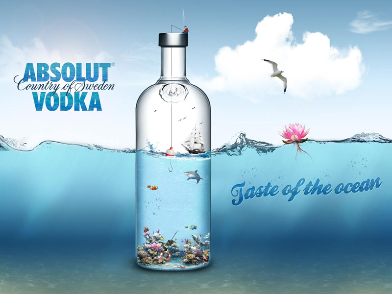
Masquerade website UI
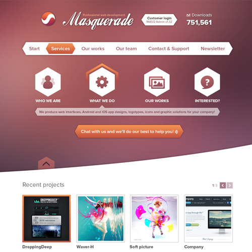
A design for a made-up web agency.
Photoshop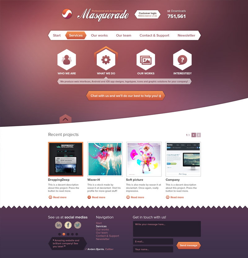
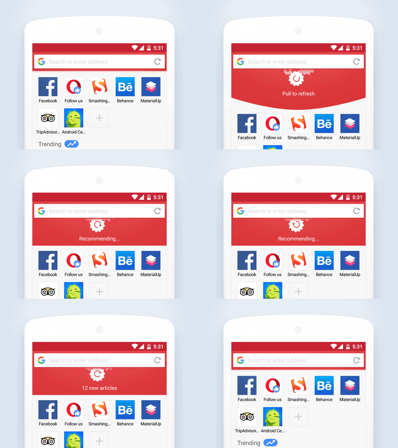
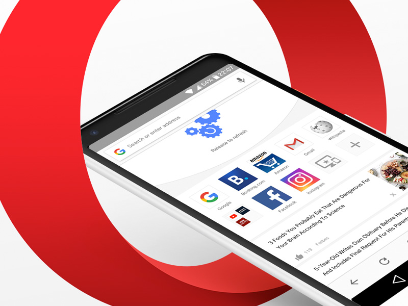
Pull To Refresh
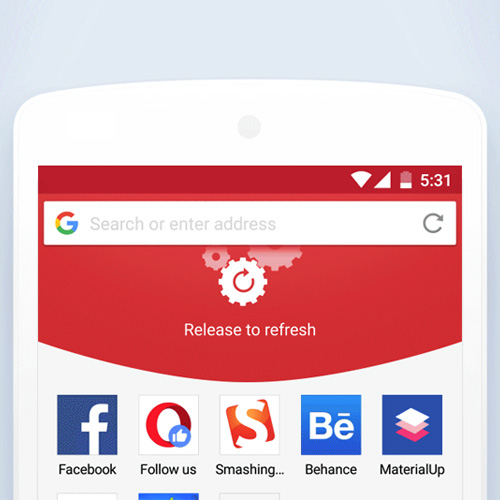
Final implementation of the pull-to-refresh action in Opera Mini.
Get Opera: http://www.opera.com/
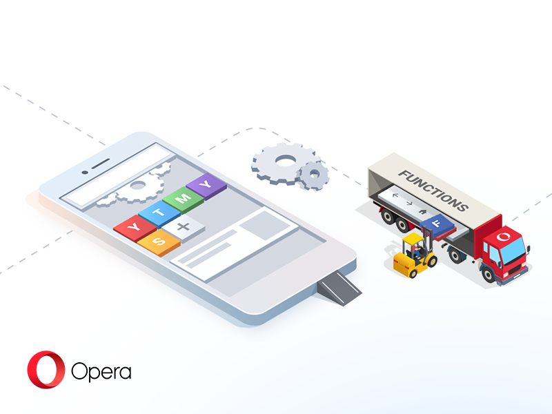
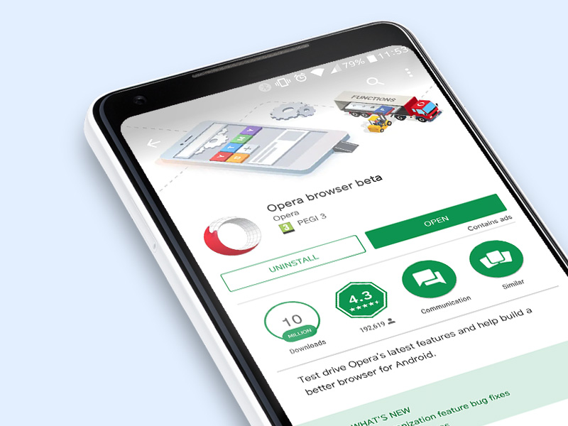
Opera for Android Beta Header
The Google Play header for Opera for Android beta version since a couple of months ago.
Get Opera: http://www.opera.com/
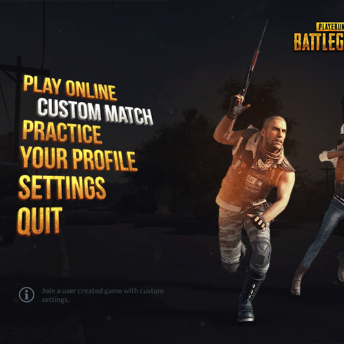
PUBG Menu Concept
The UX and UI in PLAYERUNKNOWN'S BATTLEGROUNDS has so many flaws. Every time I open the game I see more and more issues that could be improved and solved without any major fixes. I decided to freshen up the UI for the main menu a bit in this quick concept.
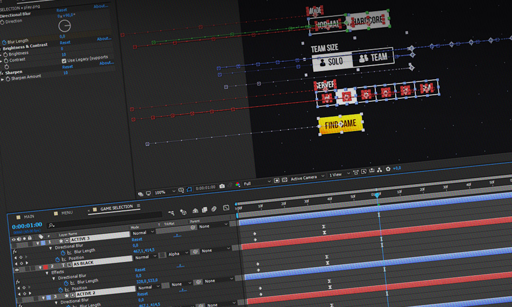
After EffectsPhotoshop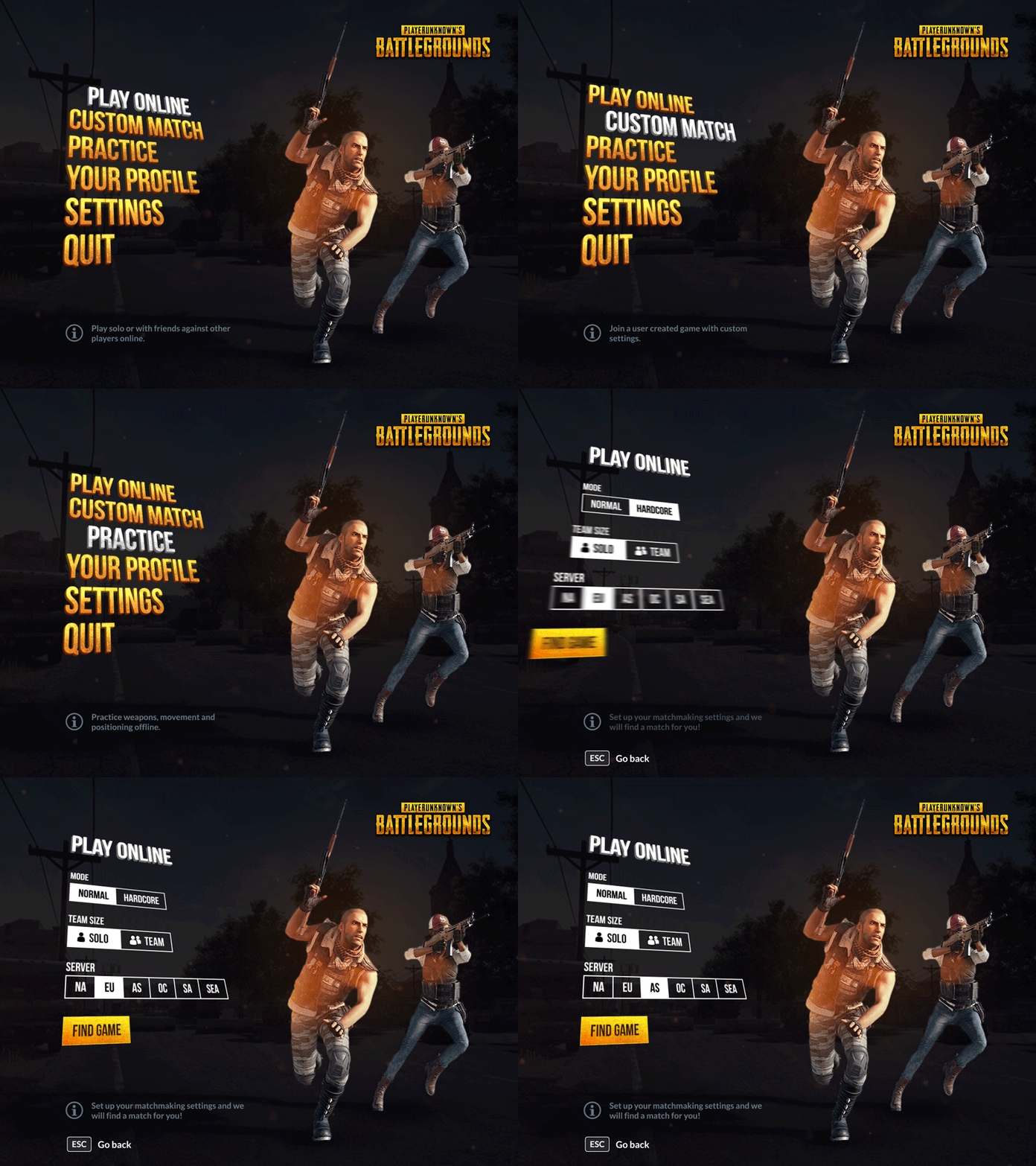
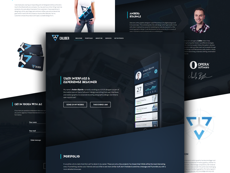
Caliber Website Design
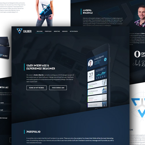
The previous design for the Caliber website. I switched from having a dark themed identity to something more positive, bright and clean. It is outdated now but still accessible through the link below.
LIVE: www.caliberdesign.se/old
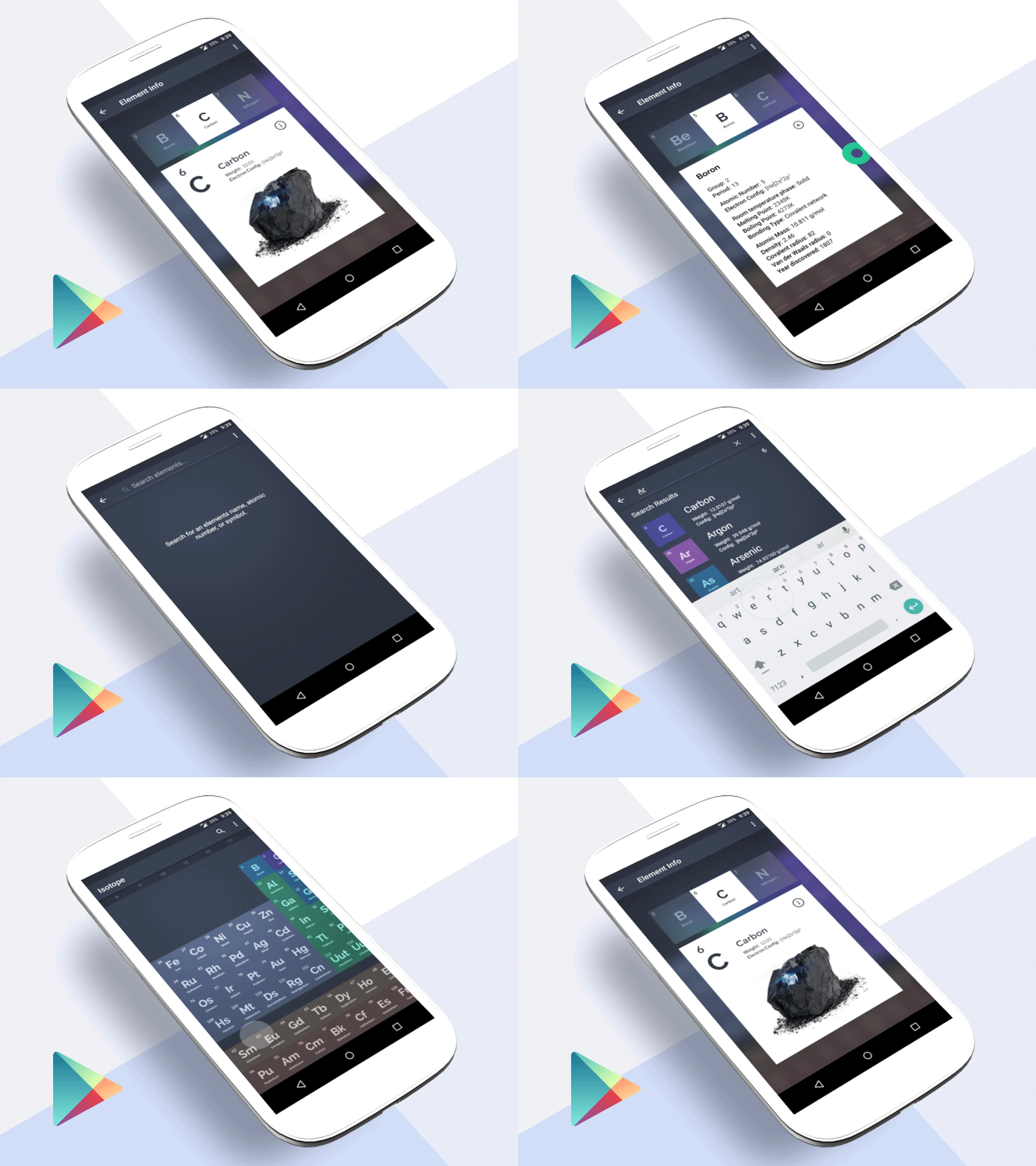
Isotope
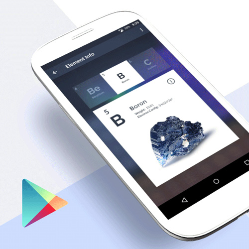
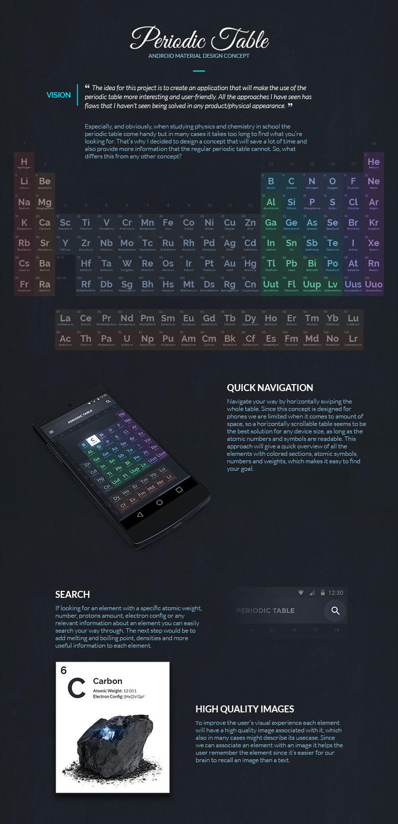
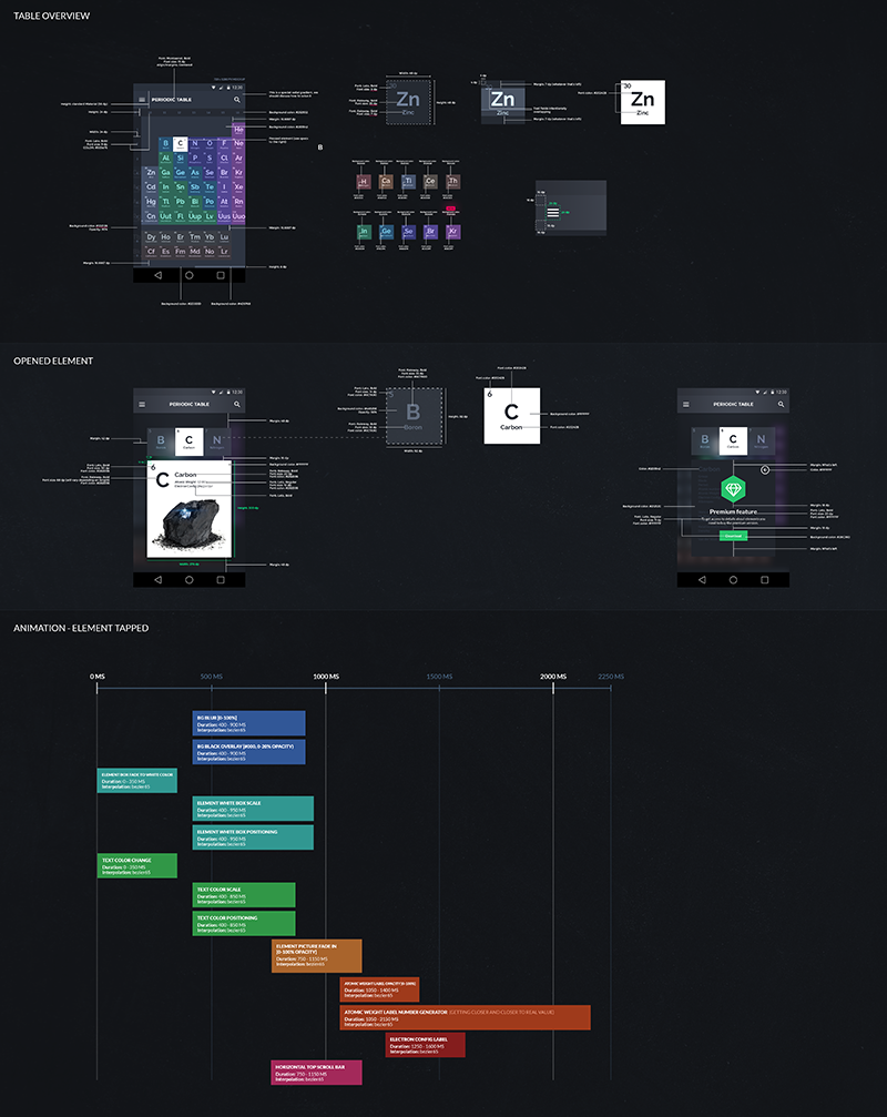
Together with a British developer (Jack Underwood) we created a periodic table app for Android based on a concept I did. After months of design, development and user interviews we released it and our app Isotope became real. We got featured on many big Android online communities, BBC’s science magazine, had an exclusive interview with UpLabs (founders of Envato) and Jack even got a job offer from this. Today we have over 150,000 installs and an average rating of 4.6.
Google Play
UpLabs interview
Featured in BBC Focus
Tweet from Google’s Android designer
Zachary Anderson Review
HowToMen Recommendation
Android Police Review
Android Police Article
Android Authority Top Apps 2016
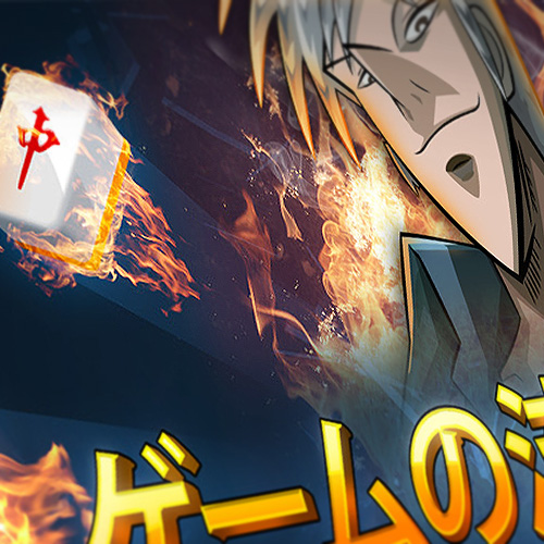
Mahjong Invitational 2016
Made this banner for a riichi mahjong tournament held at the countryside of Linköping. The event was arranged by the biggest mahjong club in Linköping. The printed version is about 2 square meters.
Photoshop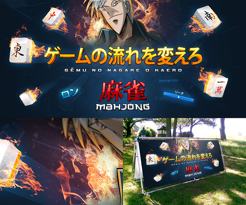
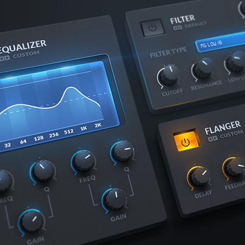
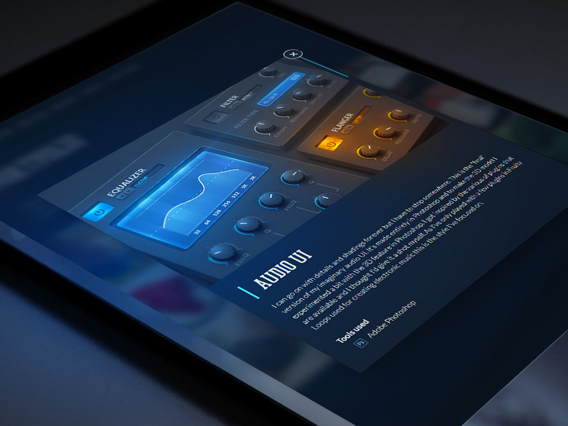
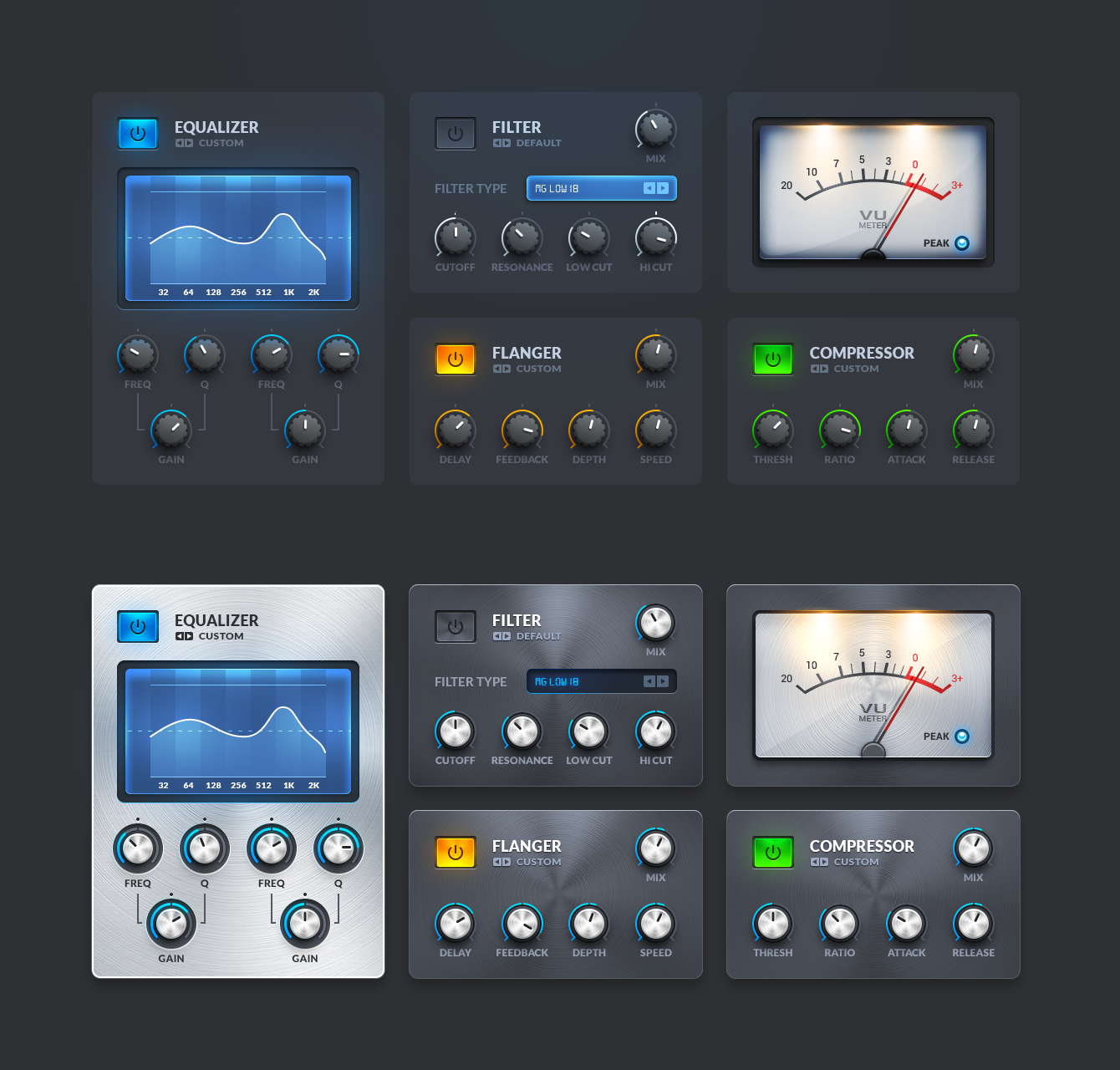
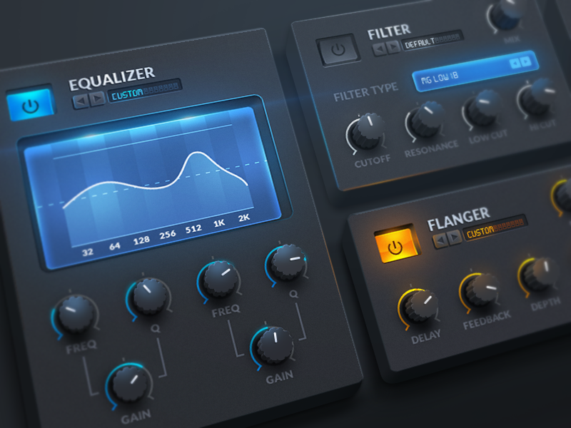
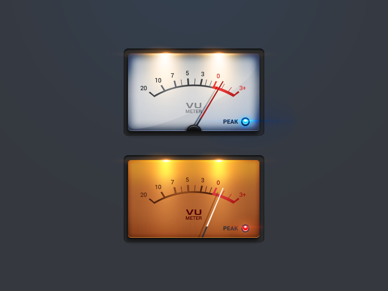
Audio UI Plugin
I can go on with details and shadings forever but I have to stop somewhere. This is the "final" version of my imaginary audio UI. In the attachment you can find a brushed steel version of the interface as well, couldn't decide which one I prefer the most 🙂
Photoshop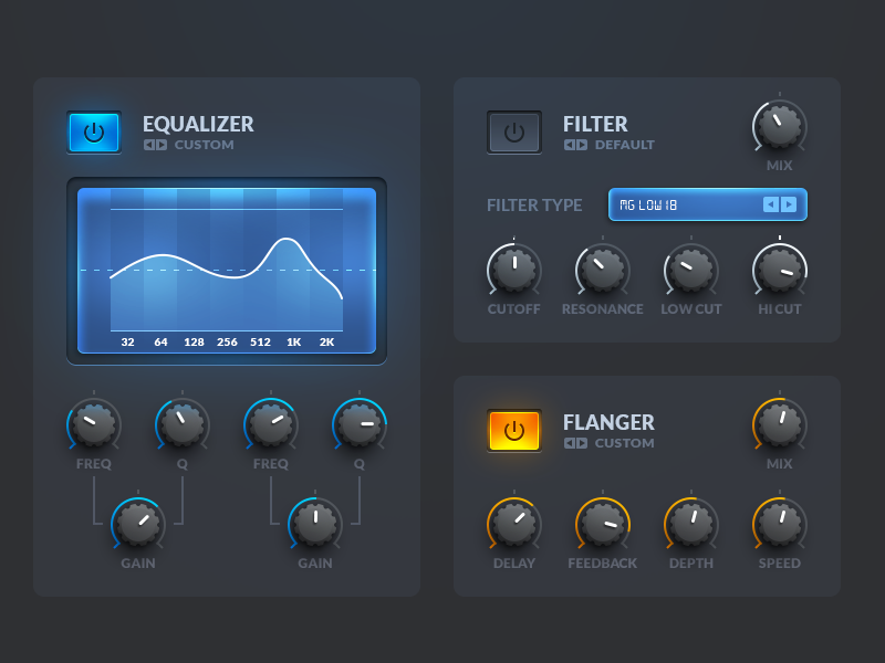
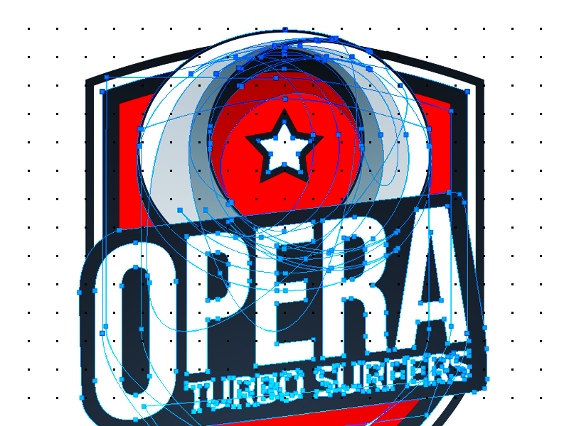
Turbo Surfers
Logotype printed on Opera branded sport jerseys. The mobile browsers of Opera uses a data savings technology we call "Turbo" which speeds up page loads while also saving a lot of data. That's why we become the "turbo surfers".
Get Opera: http://www.opera.com/
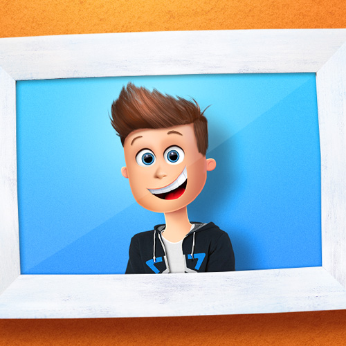
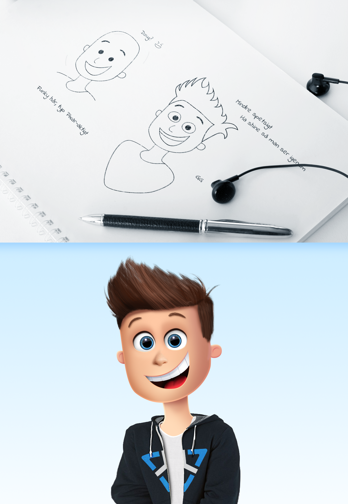
Animated Character
I've always been inspired by Pixar, Blue Sky or any other big animation studio's character style and wanted to try something on my own. I'm not experienced in 3D software so I made this entirely in Photoshop.
Photoshop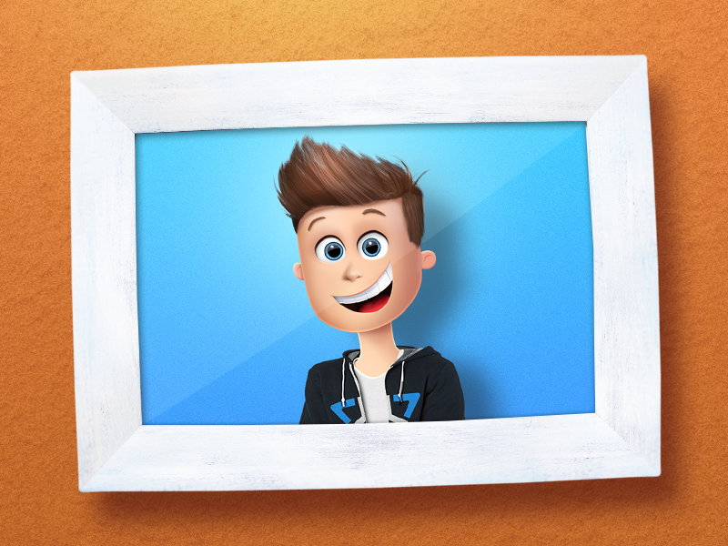
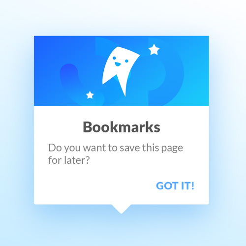
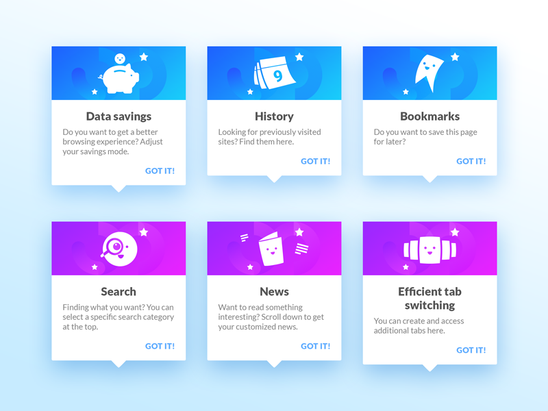
User Hints
Concept for more positive and less annoying user hints that helps the user understand and use our product in a better way.
Get Opera: http://www.opera.com/
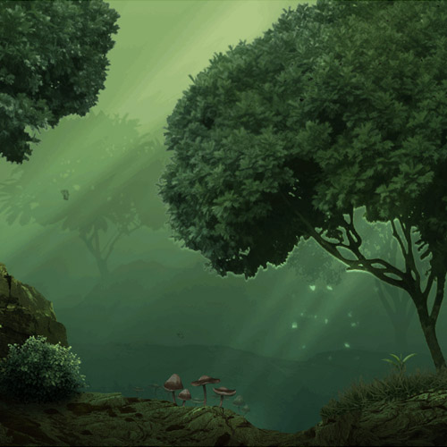
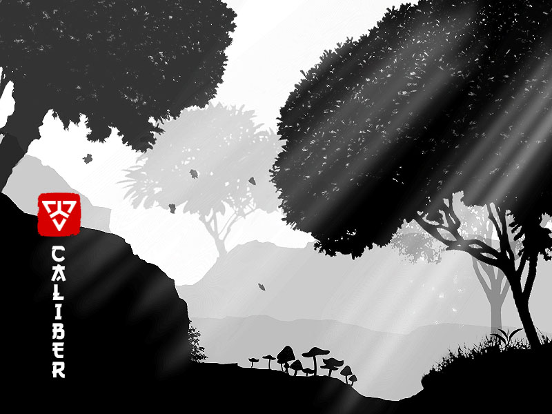
2D Game Scene
Got inspired by "Ori and the Blind Forest" and Mikael Gustafsson to do some 2D game level design, not really close to their level though.
After EffectsPhotoshop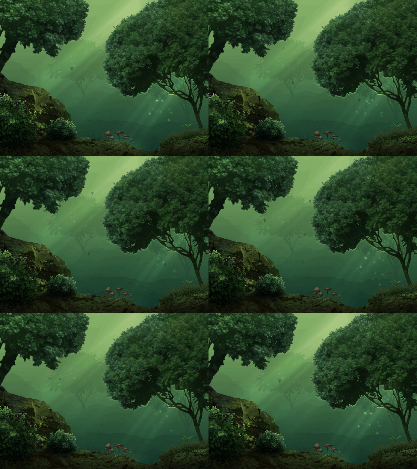
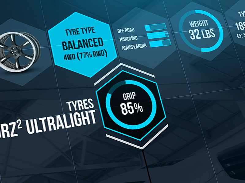
Car Wheels UI
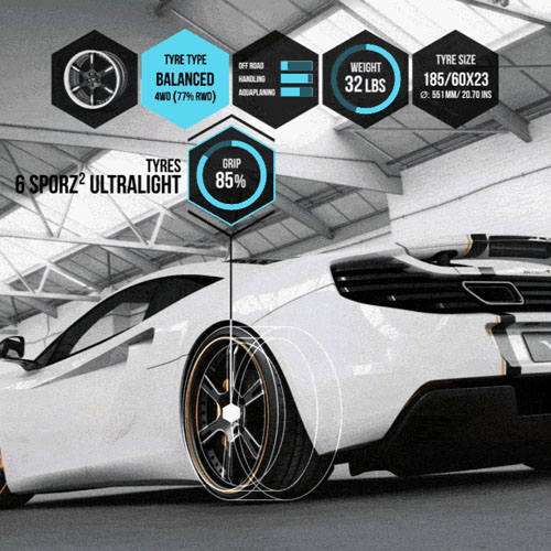
Trying out some general UI stuff in After Effects and how to use displacement maps. So the image used is a 2D photo from www.wheelsandmore.de that I make 3D by displacing bitmaps (bringing objects closer). Guess I got inspired by video games when making this.
After EffectsPhotoshop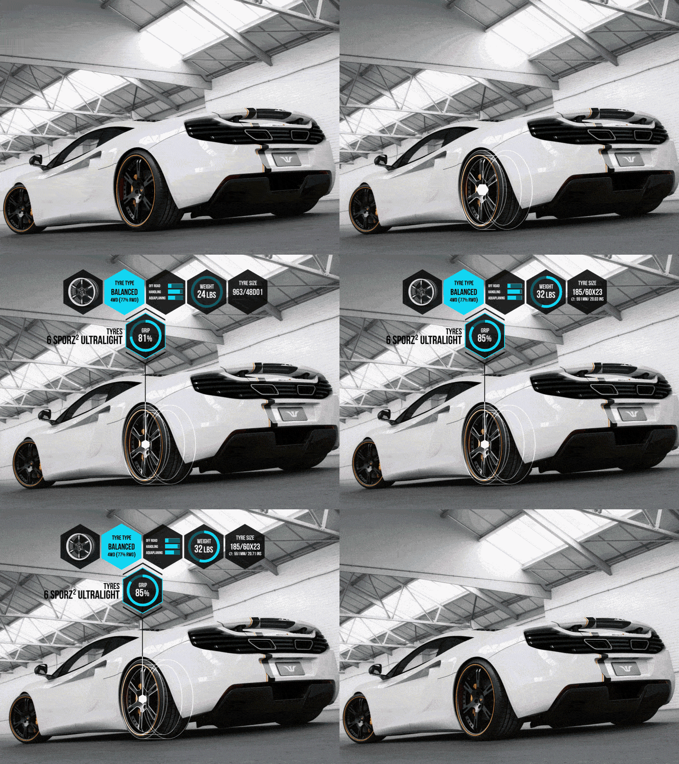
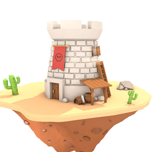
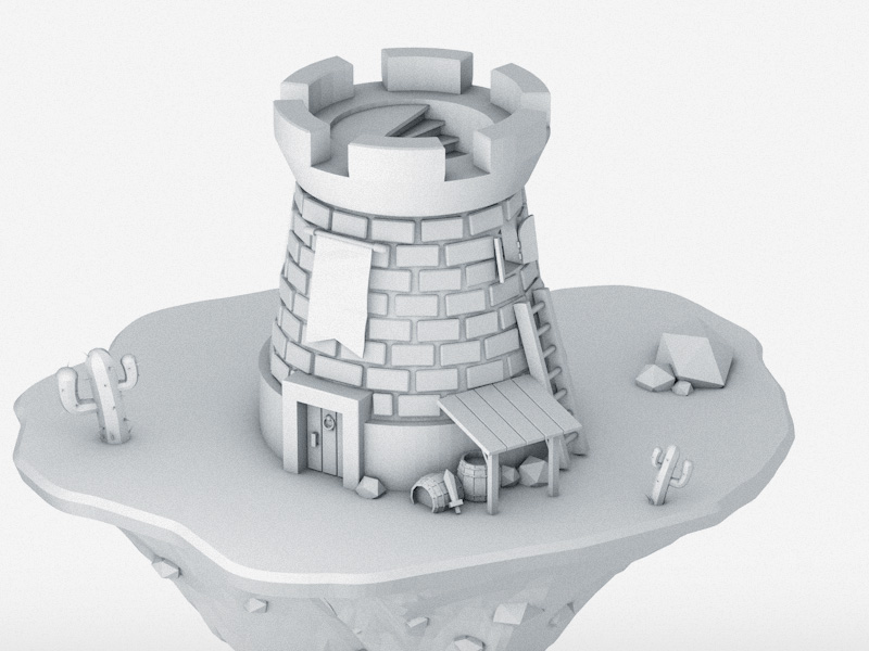
Desert tower
This is my first project in Cinema 4D with minor tweaks made in Photoshop. Box modeling can be quite enjoyable 🙂
Cinema 4DPhotoshop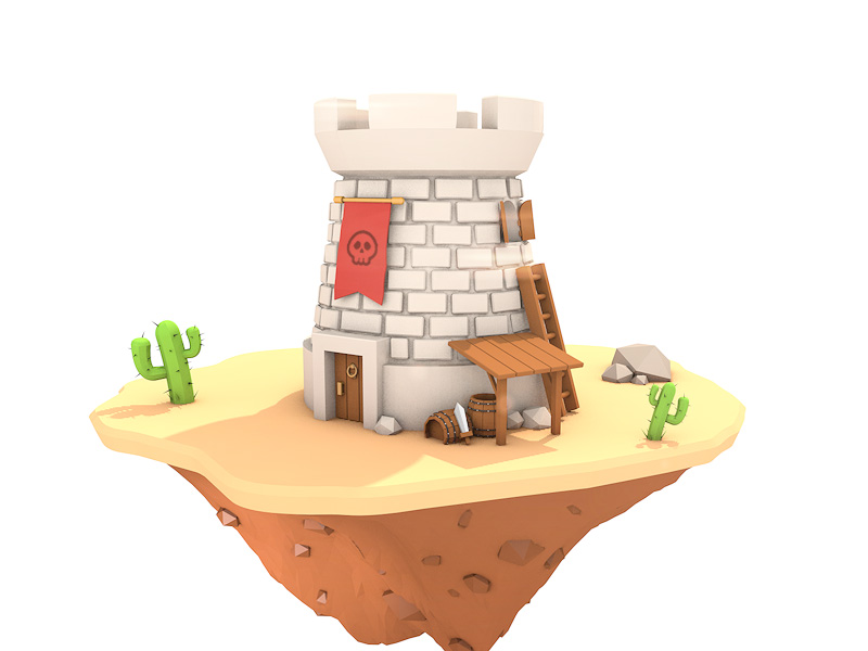
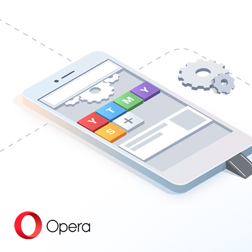
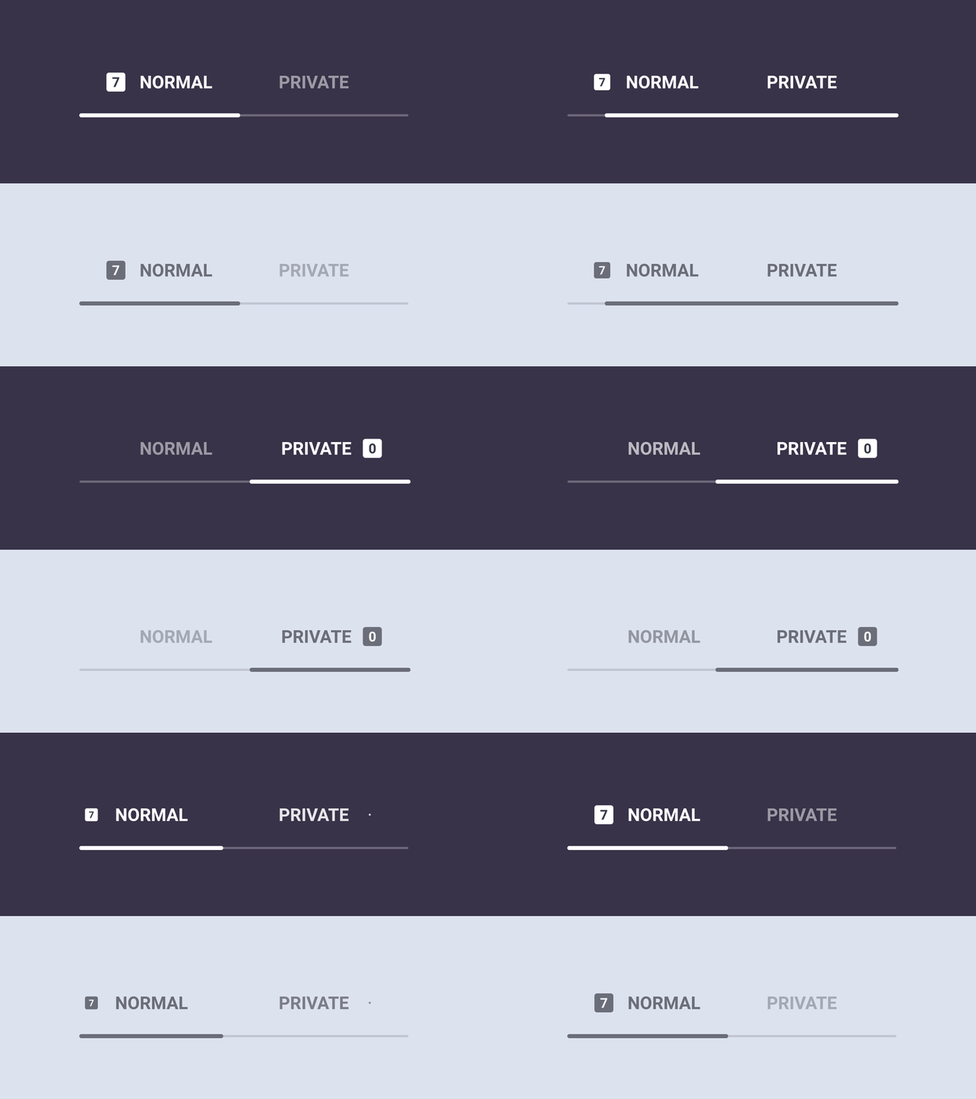
Tab mode switcher
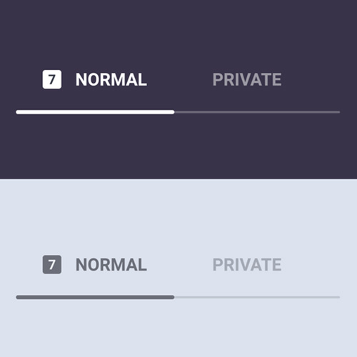
Concept for switching between normal and private (incognito) mode for Opera for Android.
Get Opera: http://www.opera.com/
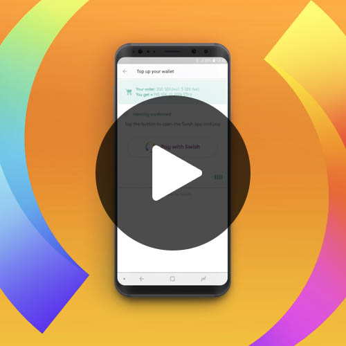
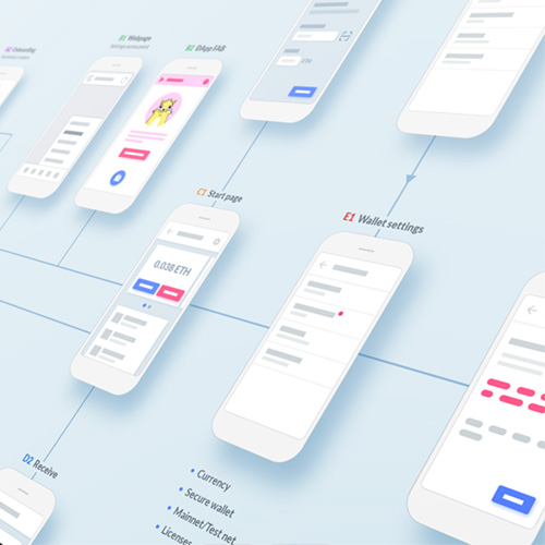
Crypto Wallet wireframes
Early wireframes for the crypto wallet feature. Have you missed it? Check it out: https://blogs.opera.com/mobile/2018/07/opera-launches-first-browser-with-built-in-crypto-wallet/
Cinema 4DPhotoshop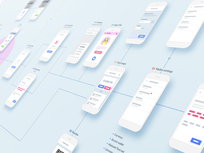
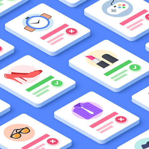
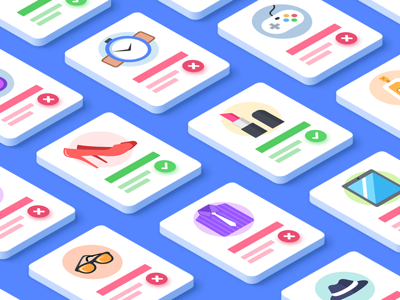
Personalized ads
Illustration for a card in our news feed allowing the user to choose whether to get personalized ads or not.
Get Opera: http://www.opera.com/
Personalized ads
This is a video announcing the cooperation between Opera and the scandinavian cryptocurrency exchange service Safello.
Get Opera: http://www.opera.com/
Loading screen concept
Loading screen concept made in After Effects using Element 3D and Saber.
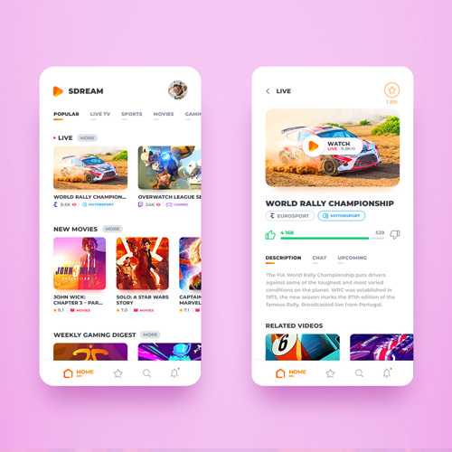
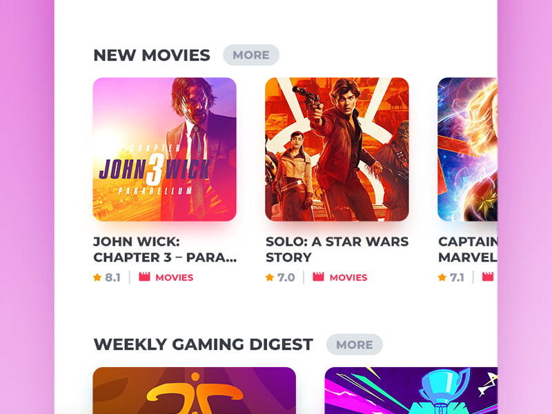
After EffectsSdream – Online Streaming
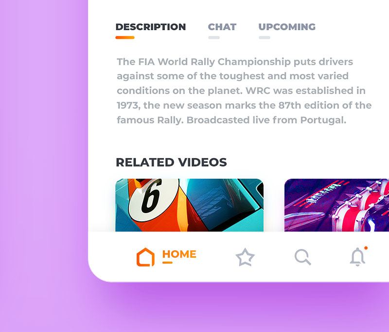
Colorful concept of a mobile streaming application that gives you the best from different platforms.
Photoshop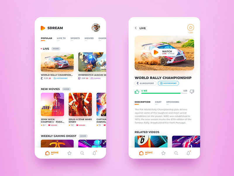
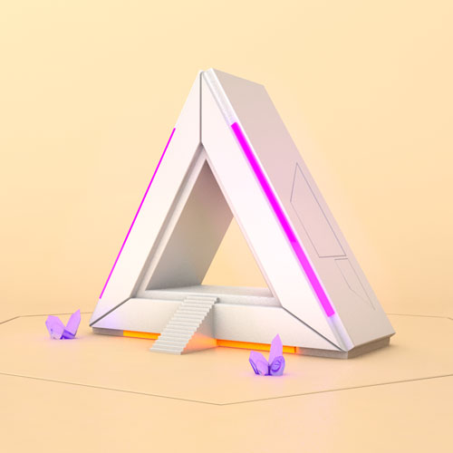
Portal to nowhere
Like literally, cause it's just a hole you can walk straight through. If you'd have a sci-fi garden this would be the perfect decoration.
Cinema 4DPhotoshop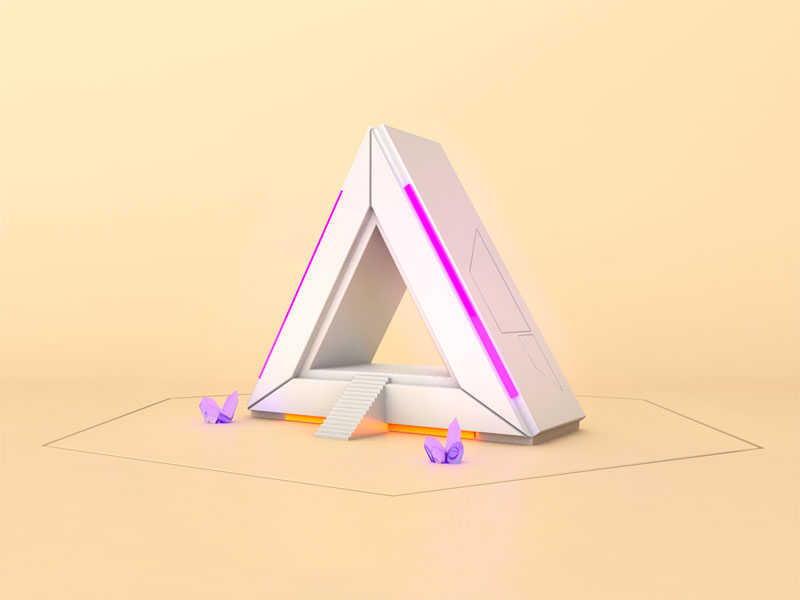
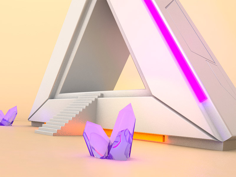
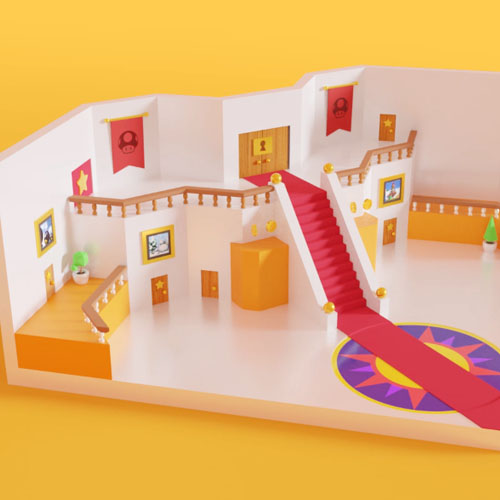
Super Mario 64 Castle
Like literally, cause it's just a hole you can walk straight through. If you'd have a sci-fi garden this would be the perfect decoration.
BlenderThemes for Opera for Android
Together with Alex Kotomanov, we designed Opera for Android version 54, giving you many more customization options to personalize your browser.
Get Opera: http://www.opera.com/
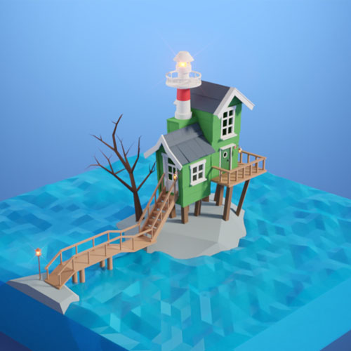
Lighthouse
I recently got inspired by one of my favorite TV shows "Skrotnisse" that I used to watch a lot when I was younger. This is the character Bertil Enstöring's lighthouse in a bit more modern version (see the original in the link below).
Blender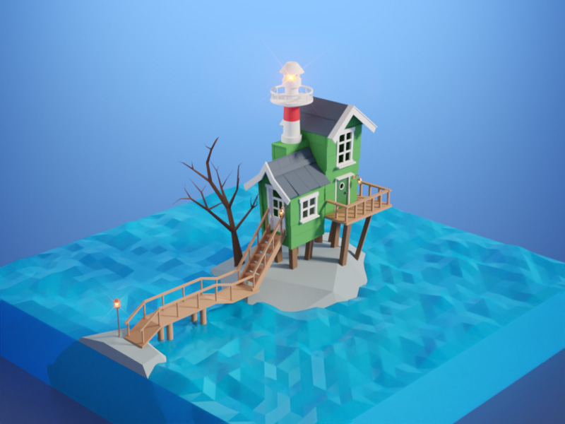
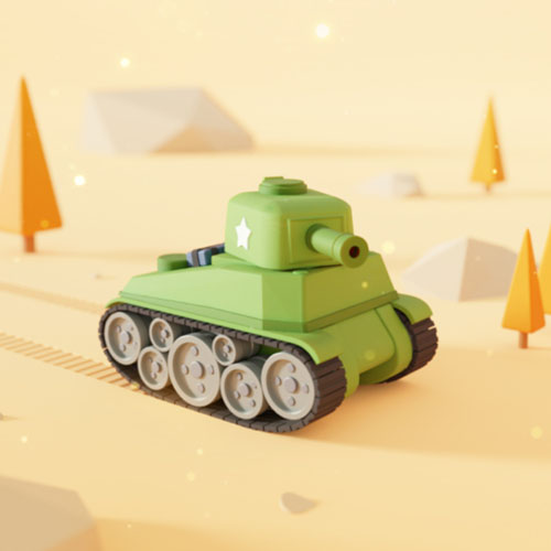
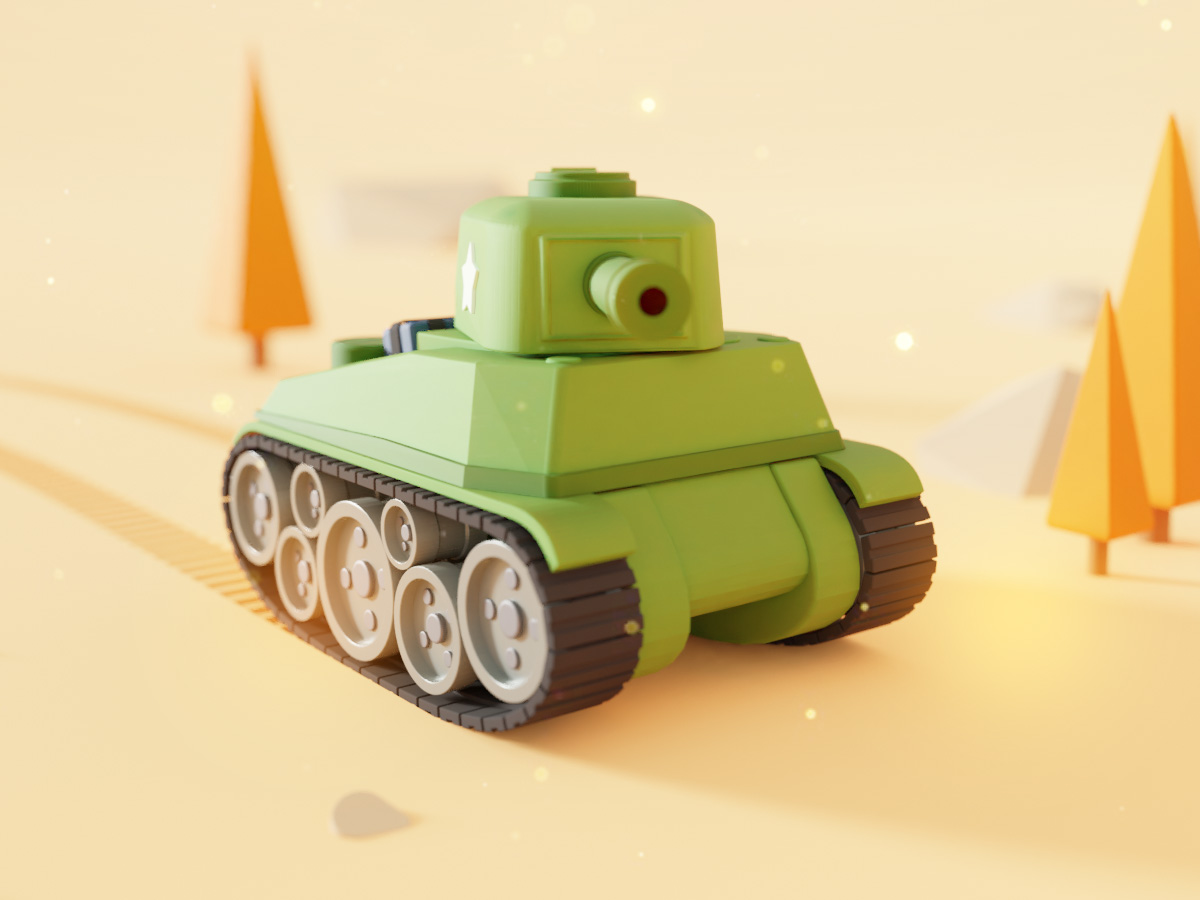
Tank
I got inspired by Battlefield V recently and by other artists I've seen on Dribbble, so I decided to give this tank a shot. Done using Blender and a little bit of Photoshop.
BlenderPhotoshop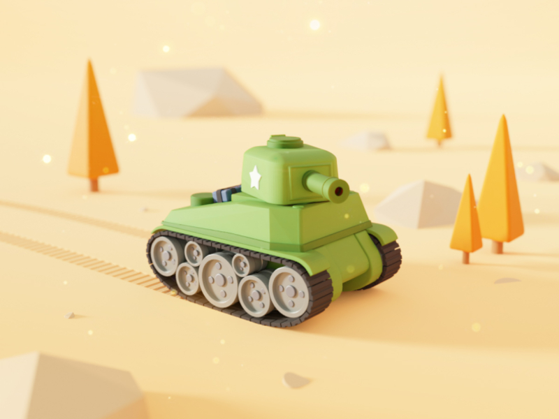
DO MORE
Short promo video for Opera. Made in Photoshop and After Effects.
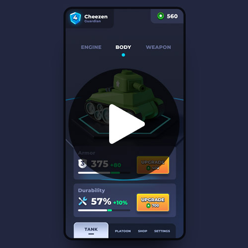
After EffectsPhotoshopTank game
Recycled my tank model in Blender and turned it into an animation combined with some After Effects wizardry.
After EffectsPhotoshopBlender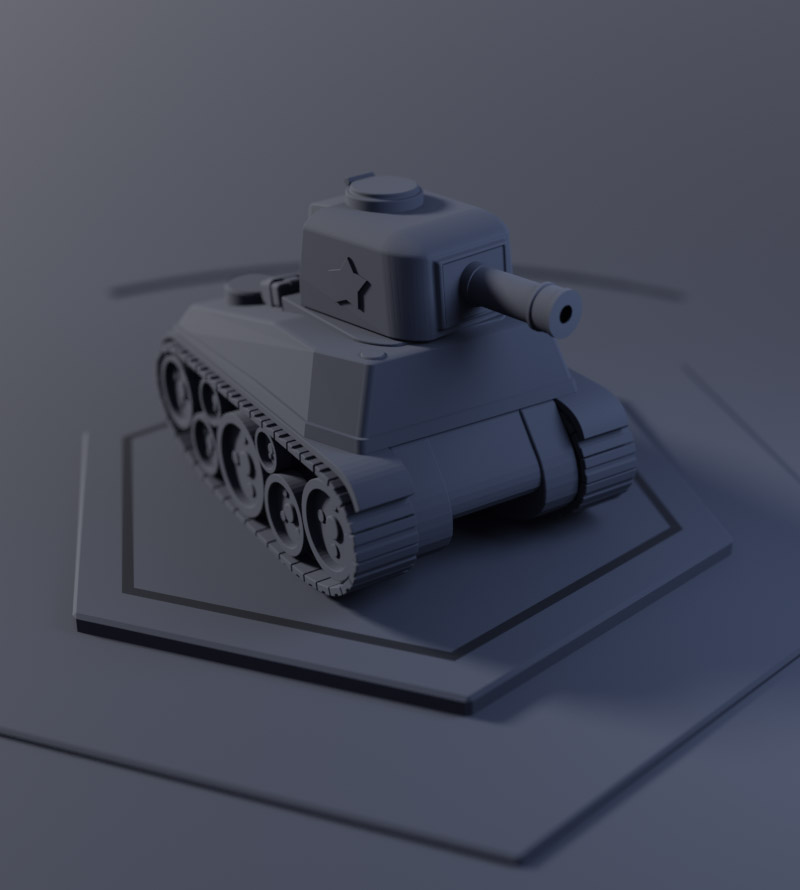
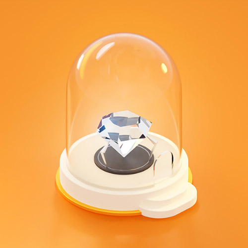
Diamond
Playing around with glass materials and refraction behavior 💎
Blender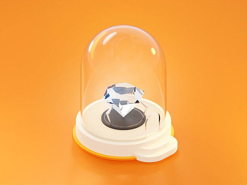
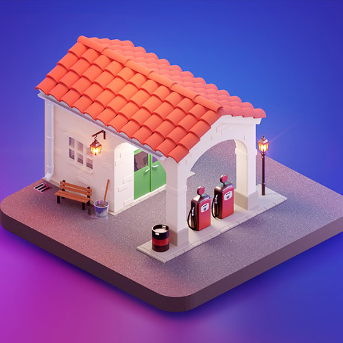
Gas station
Got very inspired by the beautiful "Ratched" TV series in many ways. This is a gas station shown early in the intro of the first episode ⛽
Blender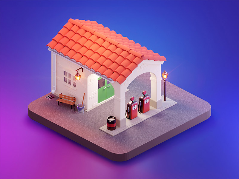
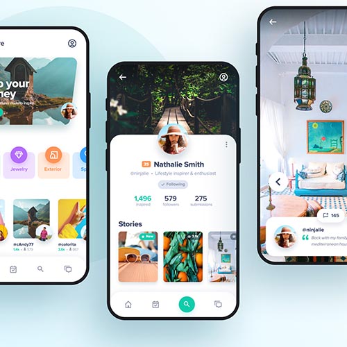
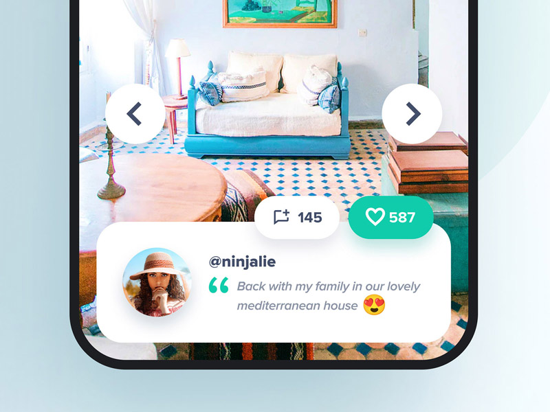
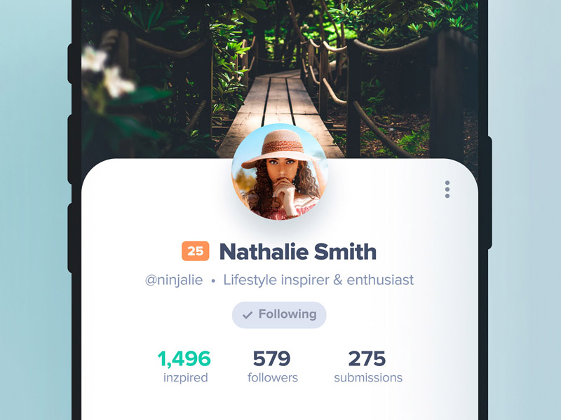
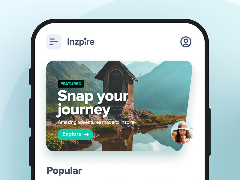
Inzpire
Falling in love with a few images I recently found, I felt the need to make something out of them. Here's a concept of an app with the purpose of influencing and inspire new lifestyles.
Figma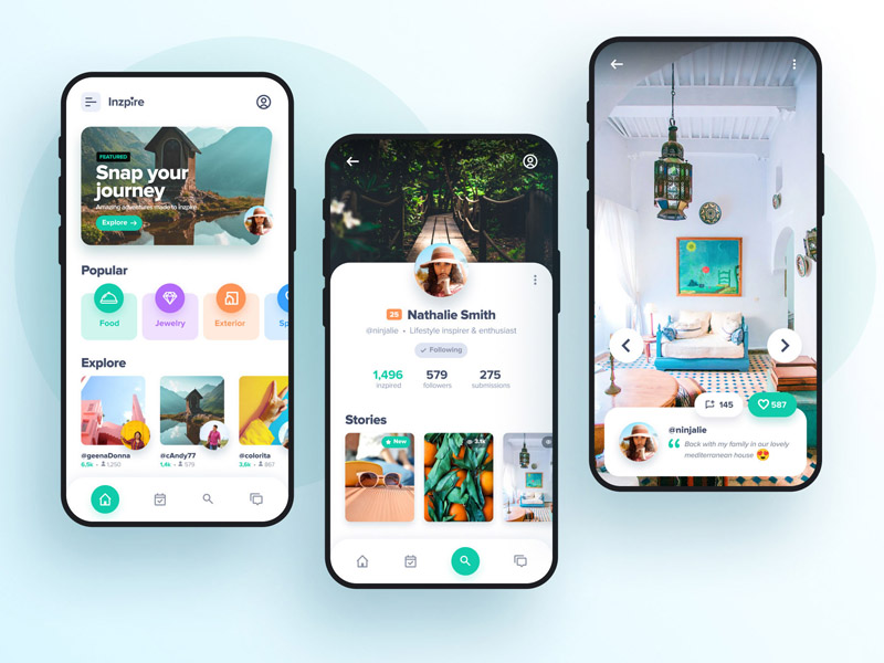
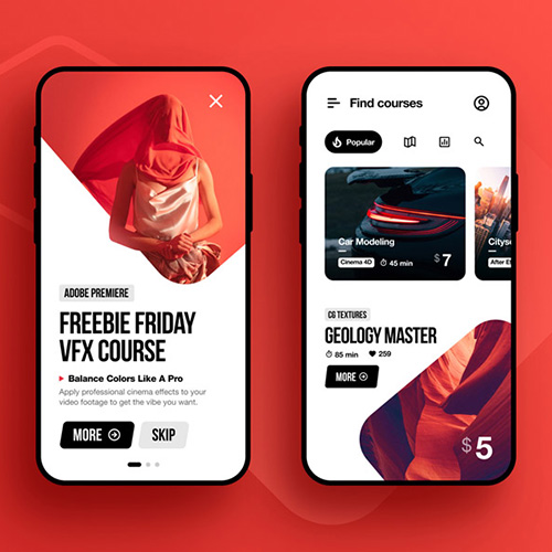
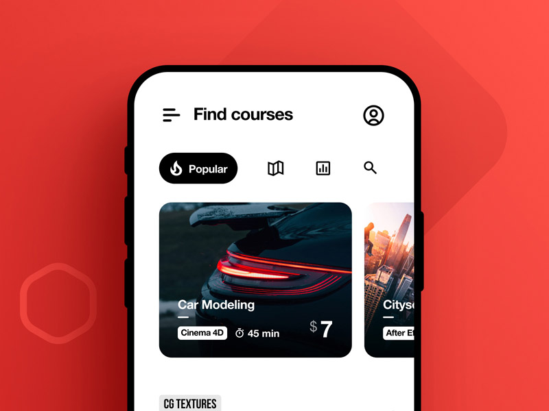
VFX Courses App
Red, white and black. A bit sporty, slightly more ninja and a lot of contrast. The idea here was to design an app with online courses teaching the user how to master different areas within the world of VFX and 3D art.
Hope you like it ✌
Figma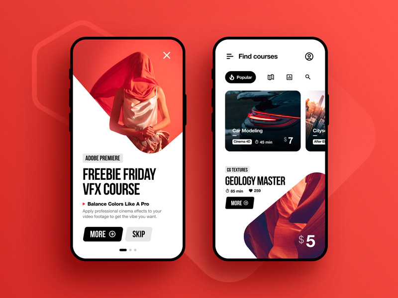
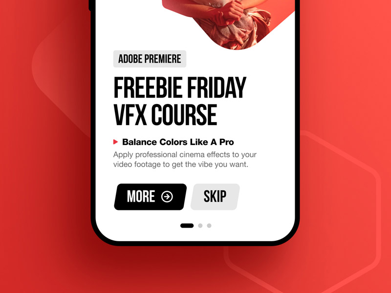
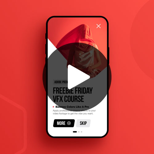
VFX Courses App Animated
Animated version of the splash/interstitial screen for the VFX courses app design.
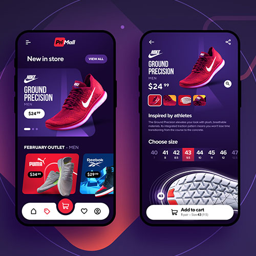
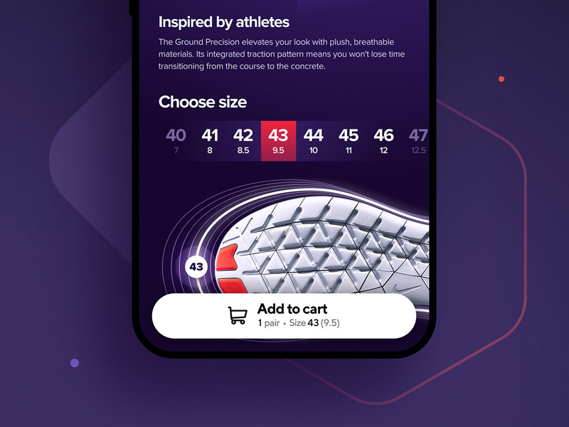
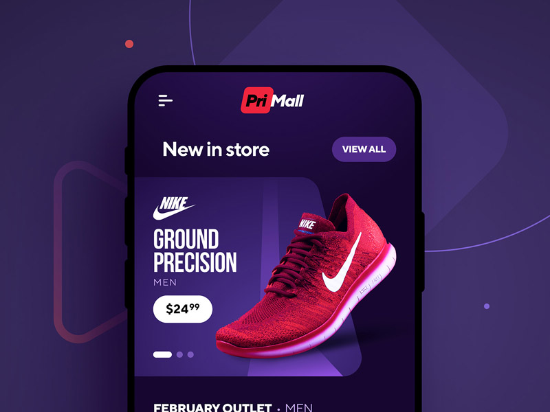
After EffectsPriMall Sports Shoes
Concept for an online store selling sports shoes and clothing.
Figma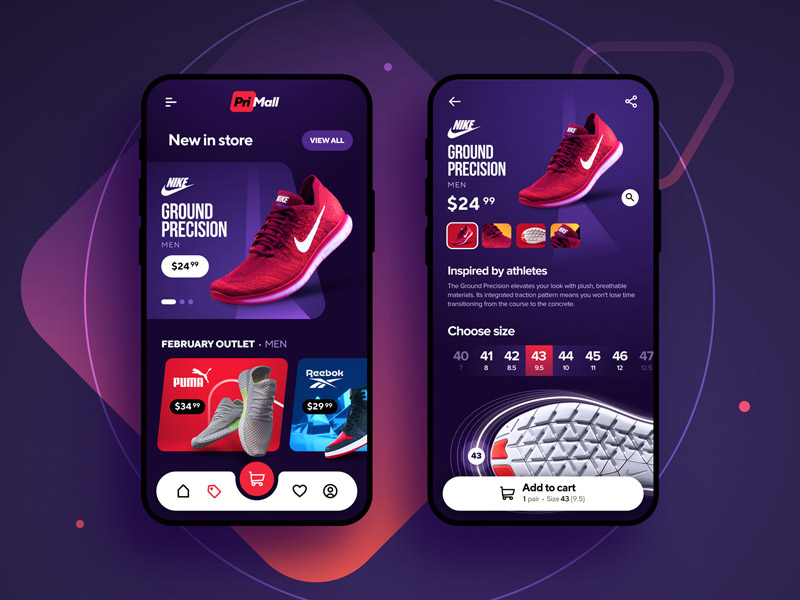
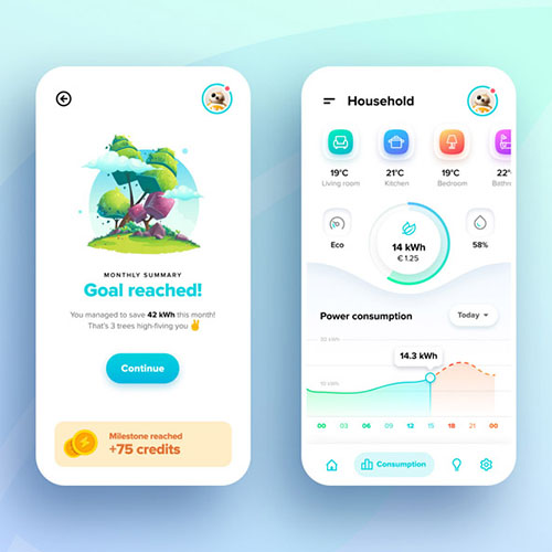
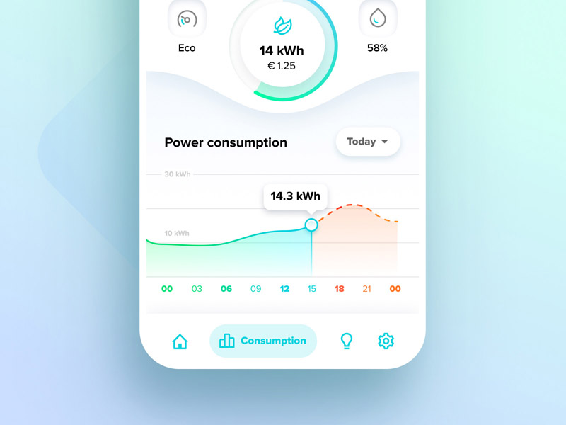
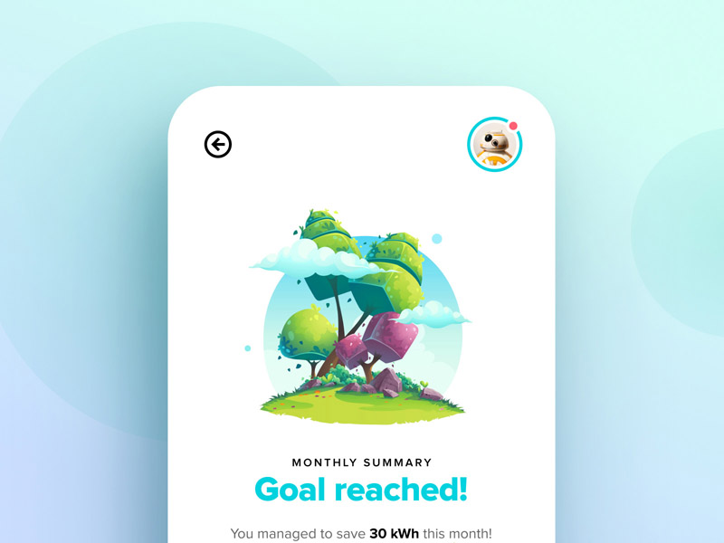
Energy App
Concept app for managing your household's electricity consumption and cost. Credits to NearBirds for the illustration.
Figma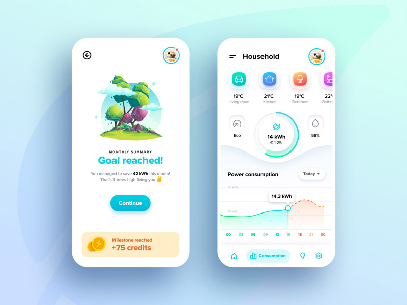
Examples of what I do
User experience & interaction design
My main area is to work with enhancing the user experience and providing good user-friendly interfaces that make sense to whoever is using it. I strive to design visually appealing interfaces that make the user smile. This in combination with backing up design decisions with research and statistics gives the best possible retention and results from a design perspective.
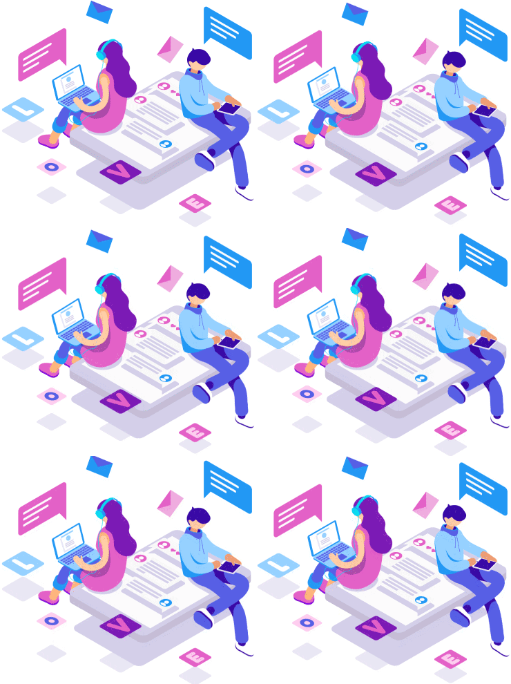

User experience & interaction design
My main area is to work with enhancing the user experience and provide good user-friendly interfaces that make sense to whoever is using it. I strive to design visually appealing interfaces that make the user smile. That in combination with backing up design decisions with research and statistics gives the best possible retention and result from a design perspective.

Marketing
If your product or identity isn’t being recognized by others, it’s hard to reach the desired user base and target audience. I will help you set up campaigns and provide material to use for blog posts, promotion videos, printed matters and much more. Whether it’s preparations for an expo or advertising in various places, we can find the solution together.
Motion design
To decorate interfaces with animations and vividness is becoming more common and it’s something I strongly promote if time and resources are on your side. By using Adobe After Effects and various tools I create animations that can easily be imported by developers without spending hours and hours of polishing tiny details.
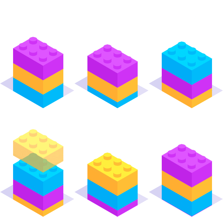

Motion design
Decorating interfaces with animations and vividness are becoming more common and it’s something I strongly promote if time and resources are on your side. By using Adobe After Effects and various other tools, I create animations that can easily be imported by developers without spending hours and hours of polishing tiny details.


